On Color and Presence
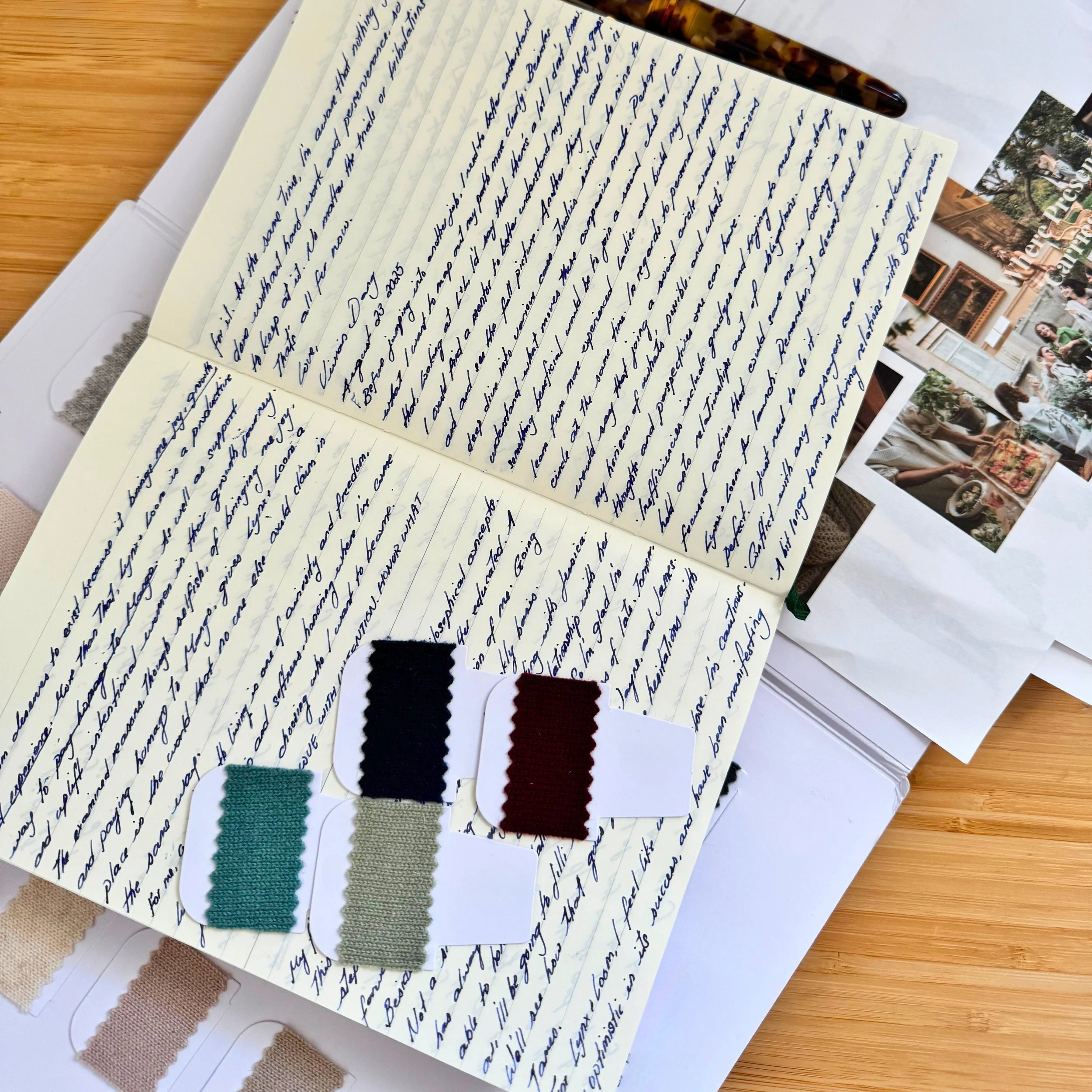
We knew the color palette couldn’t be arbitrary.
After all, these sweaters were never meant to be seasonal trends. They were designed to be lived in. Remembered. Passed down. Anchors for rituals, conversations, quiet mornings, and defining moments alike.
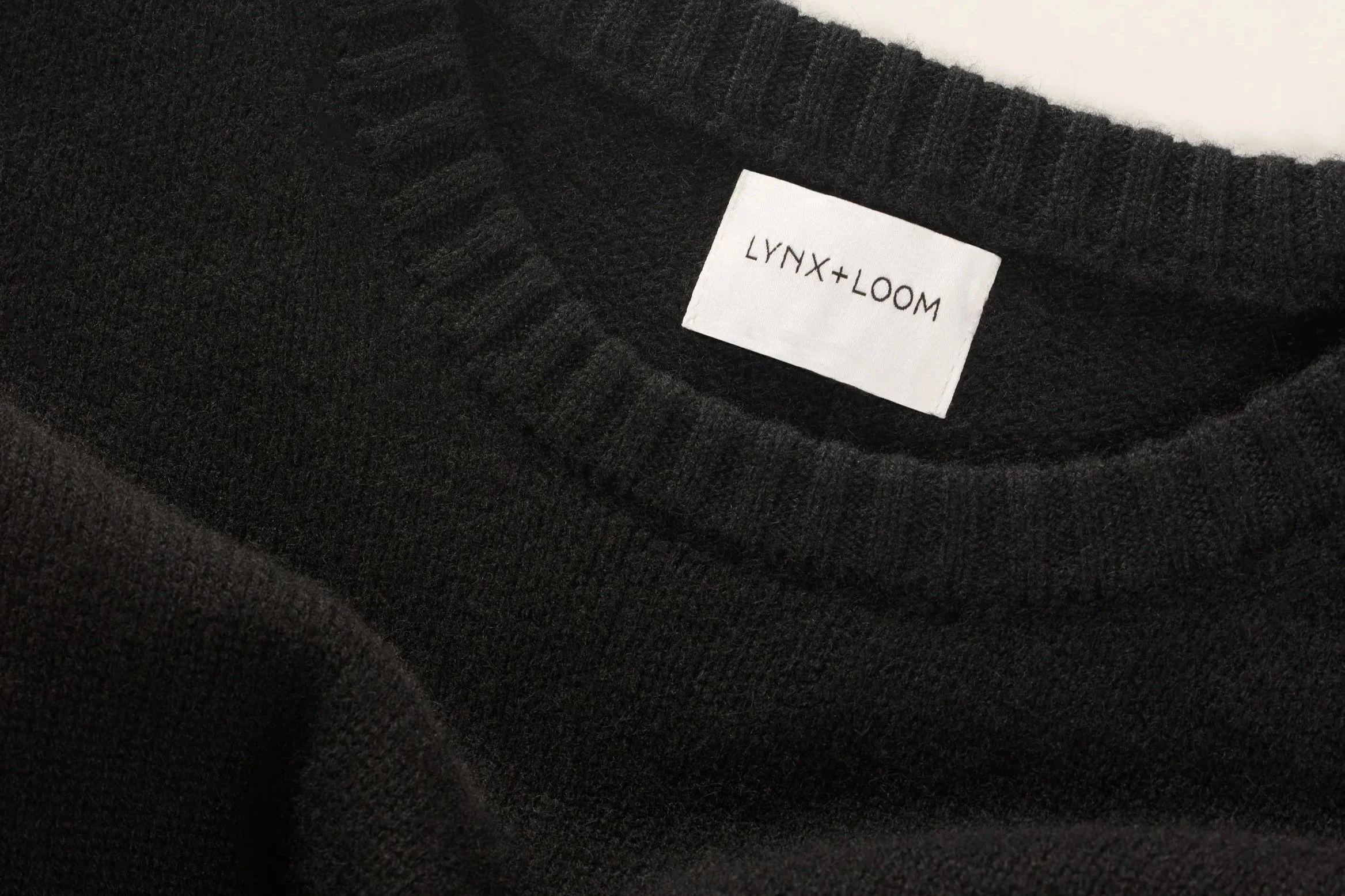
Noir is our backbone.
Not just black. Noir is a true, confident shade that brings gravity to any wardrobe. It's the one you pull on when you're about to advocate for yourself, walk into a hard meeting, or command a room without saying a word. It's the power piece: feminine, but firm. Professional without apology. Our ode to the women who understand that presence isn't loud, it's felt.
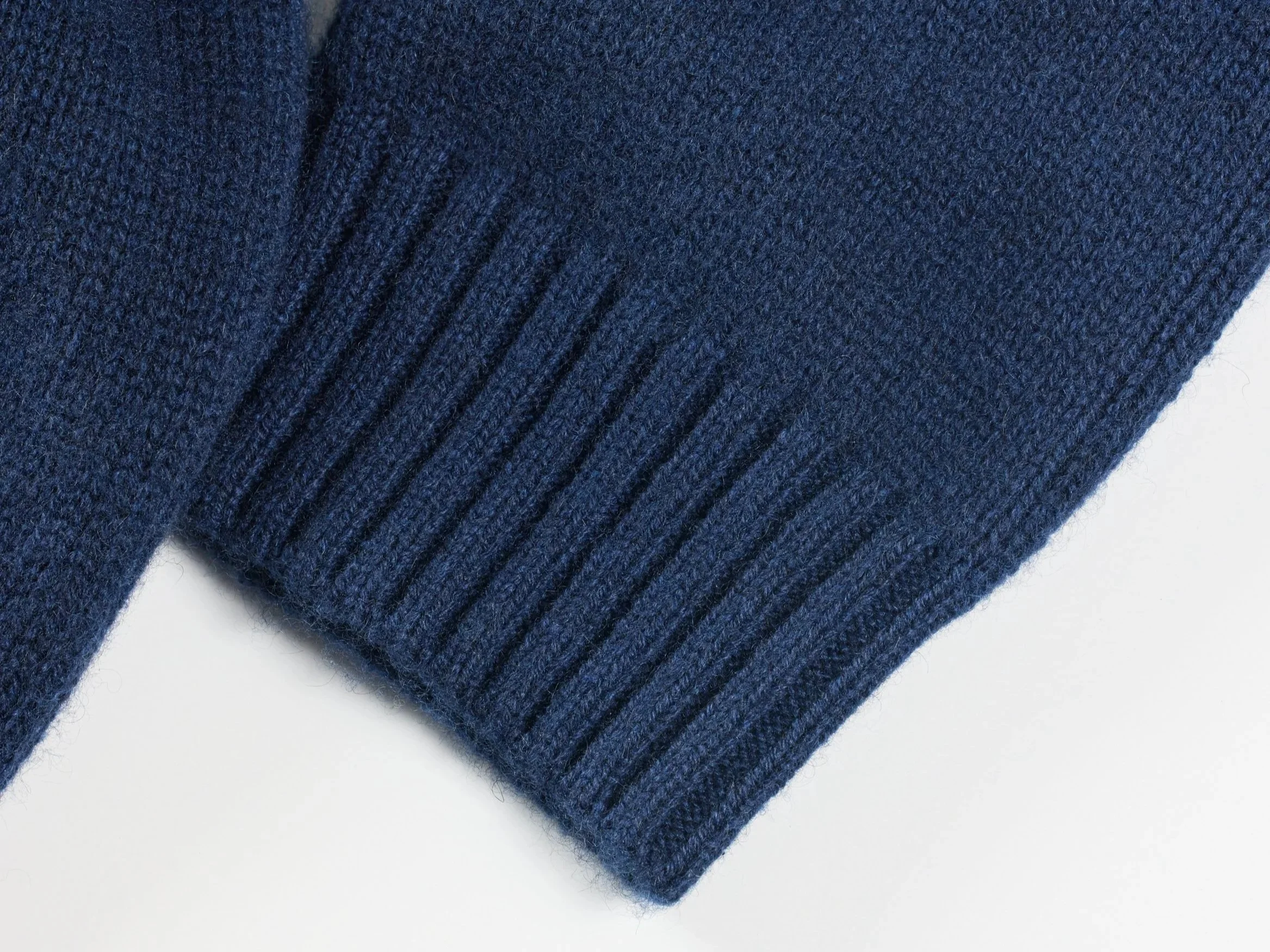
Midnight is different.
It's not your typical corporate navy. It's moodier, more expressive. A shade for the dreamers who find clarity at 1AM, for the conversations that linger long after the candles have burned low. It's the emotional center of this trio: calm and steady, but with a playful undercurrent. It holds depth without heaviness. For me, it's the color of vulnerability, of connection, and it's also Mango's color—our orange tabby, whose fur always looked brightest curled up against something blue. Sometimes the most meaningful decisions come from the quietest moments.
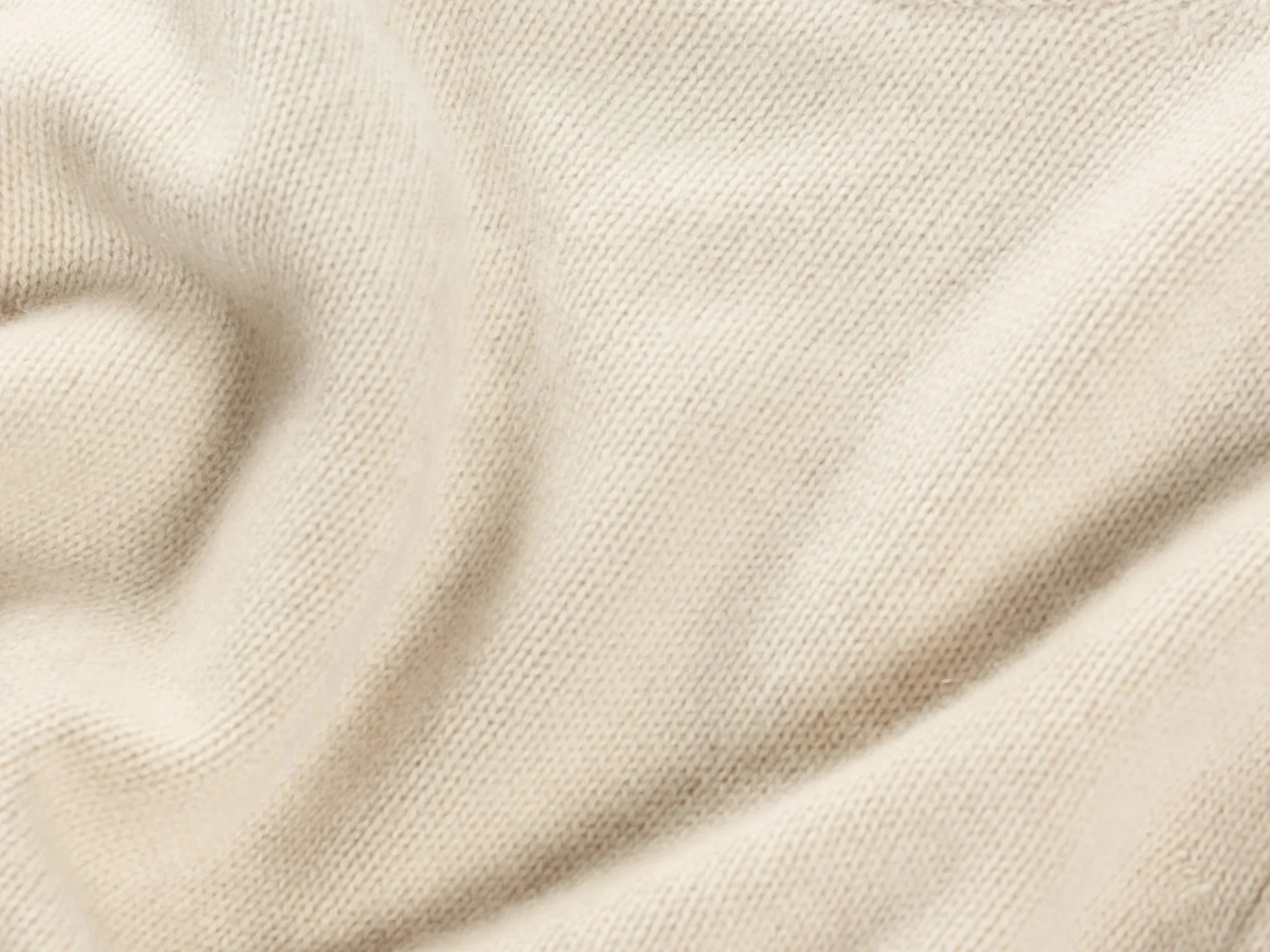
Stone, finally, is our grounding light.
Inspired by the soft quiet of morning routines and the natural elements that bring us back to ourselves. It flatters every skin tone and softens any silhouette. Stone is the pause in your day. The ritual that keeps you tethered. It's the strength in gentleness.
Originally, I wanted to include a moody green. However, stepping into the shoes of our future wearer, we realized our first colors needed to be lasting. These three, together, felt like the foundation we could build a wardrobe and a world, around.
These are not "statement colors." They are story colors. They speak in subtleties and endure through seasons. While other brands may lean into pastels and fleeting palettes, we chose depth. Weight. Presence.
And to answer the question we've been quietly asking ourselves all along: What color embodies the Weight of Presence? It's Midnight. For its complexity, its stillness, its ability to hold both your strength and your softness. It reminds us that presence isn't about being seen. It's about being felt, being remembered, and being irreplaceable in the moments that matter.
These are the hues we start with. They'll meet you in the small, defining moments; when you're sipping matcha on a cold morning, laughing under city lights, or just needing something to carry you through a hard conversation. They're not designed to impress. They're designed to last.
We're building this with you. Which of these three speaks to your story first? Tell us about a moment when you needed to feel your own presence. We're collecting these stories as we prepare to launch.
The Sable Collection is coming soon. Join our inner circle to be among the first to experience these colors.
With warmth,